ShopDreamUp AI ArtDreamUp
Deviation Actions


Suggested Deviants


Suggested Collections


You Might Like…


Featured in Groups


Description
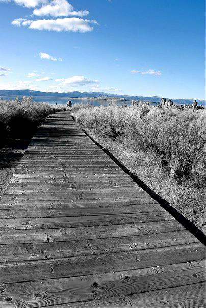
Comments please!  (Smile)")
Image size
404x604px 93.04 KB
Comments11
Join the community to add your comment. Already a deviant? Log In
I really like this photo! It has a lot of potential. The heavy emphasis on the left is countered nicely by the light color of the bushes on the right. The open space also helps to weigh down the right side and balance the image.
What really distracts me is the slanted horizon. It's very distracting to the image. It doesn't help that the lens distortion is also very visible; I think the slanted horizon's accentuating it. I'd level the photo if I were you.
Also, the vanishing point of the path feels a little too to the left. A slight crop could fix it, but then again the small castle (?) to the right would get cut off and the image would lose some impact.
I like how you colored the sky! But I think it kind of makes the real subject of the shot (the path) kind of bland in comparison. What I would do (I'm completely assuming the path is a visibly brown color) is color the path and the sky, but not anything else, including the shadows. It will provide a great contrast between opposing colors, the blue and brown, further emphasizing the difference between, dare I say, heaven and earth.
Overall I like this photo a lot. It has decent composition, has a lot of impact, and I especially like the deep, dark shadows. Good job!